Button Examples
Here are some button examples that you can use in your custom games.
Example 1 - Default Valve Button
Here is the button that valve mostly uses for Dota 2. (Valve mostly recolor them for different uses: Green for Store, Gold-ish for Dotaplus etc.)

XML:
xml
<TextButton id="DefaultValveButtonID" class="DefaultValveButtonClass" text="#DefaultValveButton"/>CSS:
css
#DefaultValveButtonID {
  horizontal-align: center;
  vertical-align: bottom;
  margin-bottom: 20px;
  box-shadow: black -4px -4px 8px 8px;
  margin-top: 20px;
}
.DefaultValveButtonClass {
  width: 270px;

  min-width: 192px;
  min-height: 36px;

  background-color: gradient(linear, 0% 0%, 0% 100%, from(#373d45), to(#4d5860));
  border-style: solid;
  border-width: 1px;

  padding: 4px 10px;

  border-top-color: #555555;
  border-left-color: #494949;
  border-bottom-color: #333333;
  border-right-color: #404040;

  transition-property: background-color;
  transition-duration: 0.05s;
  transition-timing-function: linear;
}
.DefaultValveButtonClass Label {
  margin-top: 2px;
  text-transform: uppercase;
  letter-spacing: 2px;
  color: #ffffff;
  text-align: center;
  horizontal-align: center;
  vertical-align: middle;
  text-shadow: 2px 2px 0px 1 #000000;

  transition-property: color;
  transition-duration: 0.35s;
  transition-timing-function: ease-in-out;

  font-size: 18px;
  font-family: defaultFont;
}
.DefaultValveButtonClass:hover {
  background-color: gradient(linear, 0% 0%, 0% 100%, from(#4c5561), to(#6c7d88));
  border-top-color: #aaaaaa77;
  border-left-color: #aaaaaa33;
  border-bottom-color: #333333;
  border-right-color: #404040;
}
.DefaultValveButtonClass:active {
  background-color: gradient(linear, 0% 0%, 0% 100%, from(#393939), to(#555555));
  border-top-color: #222222;
  border-left-color: #303030;
  border-bottom-color: #666666;
  border-right-color: #444444;
  sound: 'ui_generic_button_click';
}Example 2 - Purple Button
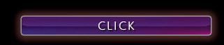
XML:
xml
<Button id="ExampleButton1">
  <Label class="ExampleButton1Label" text="#Click"/>
</Button>CSS:
css
#ExampleButton1 {
  width: 330px;
  min-height: 36px;
  box-shadow: #f78f9015 -4px -4px 8px 8px;
  background-color: black;
  border: 1px solid #aaaaaa;
  horizontal-align: right;
  vertical-align: bottom;
  margin-bottom: 20px;
  margin-top: 8px;
  margin-left: 32px;
  margin-right: 32px;
  padding: 0px;
  flow-children: down;
  background-image: url('s2r://panorama/images/textures/glassbutton_darkmoon_hover_psd.vtex');
  background-size: 100%;
  background-position: 50% 50%;
  background-repeat: no-repeat;
  transition-property: box-shadow, background-image, background-color;
  transition-duration: 0.16s;
  transition-timing-function: ease-in-out;
  border-radius: 6px;
}
#ExampleButton1:hover {
  background-image: url('s2r://panorama/images/textures/glassbutton_darkmoon_psd.vtex');
  box-shadow: fill transparent 0px 0px 0px 0px;
  border: 1px solid #555555;
}
.ExampleButton1Label {
  width: 100%;
  text-align: center;
  margin-top: 3px;
  font-size: 20px;
  font-weight: thin;
  text-transform: uppercase;
  letter-spacing: 2px;
  font-size: 22px;
  color: grey;
}Example 3 - Text Button with Icon
You can add an icon to your button -in this case, it is sized 26x26px default dota 2 logo- to make it look better.

XML:
xml
<Button id="ExampleButton2ID" class="ExampleButton2Class">
  <Panel class="Contents">
    <Panel class="CustomIcon"/>
    <Label id="ExampleButton2Label" text="#ExampleButton"/>
  </Panel>
</Button>CSS:
css
#ExampleButton2ID {
  horizontal-align: center;
  vertical-align: bottom;
  margin-bottom: 22px;
}
.ExampleButton2Class {
  background-color: gradient(linear, 0% 0%, 0% 100%, from(#6b211c), to(#8e2b19));
  border: 1px solid #bc4539;

  transition-property: border, brightness;
  transition-duration: 0.1s;
  transition-timing-function: linear;
  overflow: noclip;
  min-width: 300px;
  min-height: 45px;
}
.Contents {
  horizontal-align: center;
  vertical-align: middle;
  flow-children: right;
  margin: 0px 20px;
}
.CustomIcon {
  background-image: url('s2r://panorama/images/control_icons/dota_logo_white_png.vtex');
  background-size: contain;
  width: 26px;
  height: 26px;
  margin-top: 4px;
  margin-right: 4px;
  horizontal-align: center;
  vertical-align: middle;
}
.ExampleButton2Class:hover {
  brightness: 2;
}
.ExampleButton2Class:hover Label {
  color: white;
}
.ExampleButton2Class:active {
  brightness: 3;
  border: 1px solid #501f18;

  sound: 'ui_generic_button_click';
}
.ExampleButton2Class Label {
  margin-top: 2px;
  text-transform: uppercase;
  color: white;
  horizontal-align: center;
  font-weight: bold;
  font-size: 24px;
  letter-spacing: 2px;
  text-align: center;
  vertical-align: middle;
  text-shadow: 0px 0px 6px 1 #000000;
  padding-left: 8px;
  padding-right: 8px;
  padding-top: 2px;

  transition-property: color;
  transition-duration: 0.1s;
  transition-timing-function: linear;
}
.ExampleButton2Class:active Label {
  transform: translateY(1px);
}Example 4 - Popup ESC Menu Buttons
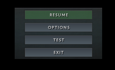
XML:
xml
<Panel id="PopupESCMenu">
  <Panel id="ESCActionButtons">
    <Button id="ESCResumeButton" class="ButtonBevel ESCMenuButton">
      <Label text="RESUME" />
    </Button>
    <Button id="ESCOptionsButton" class="ButtonBevel ESCMenuButton">
      <Label text="OPTIONS" />
    </Button>
    <Button id="ESCTestButton" class="ButtonBevel ESCMenuButton">
      <Label text="TEST" />
    </Button>
    <Button id="ESCExitButton" class="ButtonBevel ESCMenuButton">
      <Label text="EXIT" />
    </Button>
  </Panel>
</Panel>CSS:
css
#PopupESCMenu {
  width: 350px;
  vertical-align: center;
  horizontal-align: center;
  opacity: 1;
  transform: none;

  transition-property: opacity, transform, pre-transform-scale2d, wash-color;
  transition-duration: 0.4s;
  transition-delay: 0s;
  transition-timing-function: ease-in-out;
  box-shadow: #00000099 -4px -4px 8px 8px;
  flow-children: down;
  padding: 2px;
  background-image: url('file://{images}/custom_game/interface/esc_bg_psd.png');
  background-position: center top;
  background-color: none;
}
#ESCActionButtons {
  flow-children: down;
  width: fit-children;
  horizontal-align: center;
}
.ButtonBevel {
  width: 270px;
  min-width: 192px;
  min-height: 36px;

  margin-top: 8px;
  margin-bottom: 6px;

  background-color: gradient(linear, 0% 0%, 0% 100%, from(#373d45), to(#4d5860));
  border-style: solid;
  border-width: 1px;

  padding: 4px 10px;

  border-top-color: #555555;
  border-left-color: #494949;
  border-bottom-color: #333333;
  border-right-color: #404040;

  transition-property: background-color;
  transition-duration: 0.05s;
  transition-timing-function: linear;
  box-shadow: #00000055 -2px -2px 4px 4px;
}
.ESCMenuButton {
  margin-top: 8px;
  margin-bottom: 6px;
  width: 270px;
}
#ESCResumeButton {
  background-color: #589c5e33;
}
#ESCResumeButton:hover {
  opacity: 1.3;
}
.ESCMenuButton Label {
  font-weight: normal;
  color: gradient(linear, 0% 0%, 0% 100%, from(#eaeaea), to(#ababab));
}